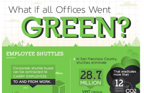
I get regular offers for guest posts on “greening the office,” and end up turning most of them down – generally, not much new on that front, and most of us know that we can print on both sides of the paper, etc. What’s the impact of these changes, though? Usually, the writer pitching the post has no idea.
That’s why this infographic from Metrofax caught my eye: it goes beyond the obvious (“LED bulbs save energy”), and lays out actual measurements for the savings created by certain activities… and, as we all know, what gets measured gets managed. The company also shares the math behind these measurements on its blog – just click on the graphic itself if you want to see their work.
Got thoughts on the claims made here? Share them with us…
Infographic Courtesy of Metrofax


Rachel Simmons
Thanks for sharing this, Jeff! The cheapest form of energy is the energy you don’t use. This is a great visual representation of the return even small improvements can have.
Jeff McIntire-Strasburg
Thanks for sharing your thoughts, Rachel!