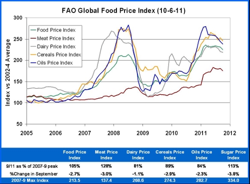
I have been posting updates on the most recent, global food price spike since February 2011 – most recently in June. Yesterday, the Food and Agriculture Organization of the UN (FAO) released its most recent data on the prices of food in international trade. As seen in the graph above, the overall index and its various components have declined slightly, but remain at very high levels.
People living in the developed world have seen some food price increases, but because we grow so much of our own food and spend a small part of our income on feeding ourselves, the impact is minor. This has the greatest effect on the lives of poor people in import-dependent countries.
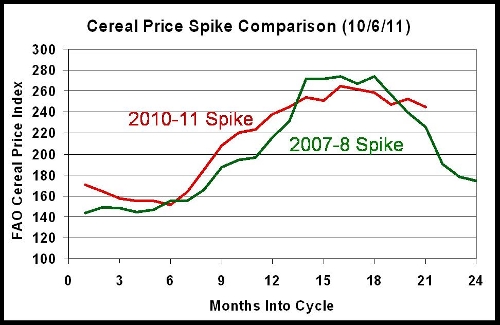
What is actually most unsettling about this phenomenon is that nothing like it has occurred for decades, and yet we are in a second such spike. The first was in 2007/8, and the current spike has been in 2010/11. In this post I want to compare these two spikes.
The graph above compares the two spikes on a month-by-month basis beginning in January of the starting year. What we see is a later and/or slower decline in prices. The earlier spike showed a steep decline after 19 months, while in 2010 the decline is just beginning at 21 months. That is for the aggregate “food index,” but a similar broadening of the spike appears to be occurring for the cereals-specific index (see below). Similar trends are seen with the dairy and oils indices.
The most dramatic difference between the 2007-8 and 2010-11 spikes is the path of the meat price index (see graph below). Meat prices in international trade showed only a minor bump in the first spike, but were the most changed category in the current round. The index did drop 3% from August to September which may represent an earlier reversal than in 2008.
It would be best not to over-interpret these trends, but also unwise to ignore them completely. We know that basic food demand is rising between population growth and an increased standard of living in many populous regions of the world. We know that energy prices are high. It will take the benefit of years of hindsight to know whether climate change has been contributing to these unusual price patterns. If the current spike is like the last one, it should be largely corrected by the end of 2011. For now, I plan to update this series in January of 2011 with three more months of data.
Data from FAO, graphs by Steve Savage
You are welcome to comment here or to email me at [email protected]
My website is Applied Mythology


Juan Miguel Ruiz
These figures are quite alarming indeed. Pure data never lies, and this information shows the suffering of so many people (current unemployment rates are not helping, obviously), both in the States and other less-developed countries. I suspect, as you said, that the environment is a huge factor in these current spikes but hopefully careful planning for the future might be able to mitigate the effects of any re-occurrences.
Juan Miguel Ruiz (GreenJoyment)